I’m bringing on a new UX (User Experience) person on my team, and that triggered a search through my archives of drawings and documents. That’s when I tripped across these “customer journey maps” I developed two years ago for (now defunct) NRG Home Solar. As simple as they are, I’m rather proud of them, and they were actually inspirational enough for an outside consulting firm to use them as the basis for their “persona-based” site design for our new website (which alas, never launched).
Search for “Customer Journey Mapping”, and you’ll find lots of templates and diagramming styles. I wasn’t satisfied with most, because they didn’t keep to the “Keep it Simple” principle, and didn’t seem to answer a need – like, who’s going to read this diagram, and for what reason?! Diagrams should be able to convey a lot of information concisely, but without clutter. They should be prompts for discussion within your organization – and we’re all busy within our organization, so keep it simple, keep it lighthearted, keep it fun as well as thought-provoking.
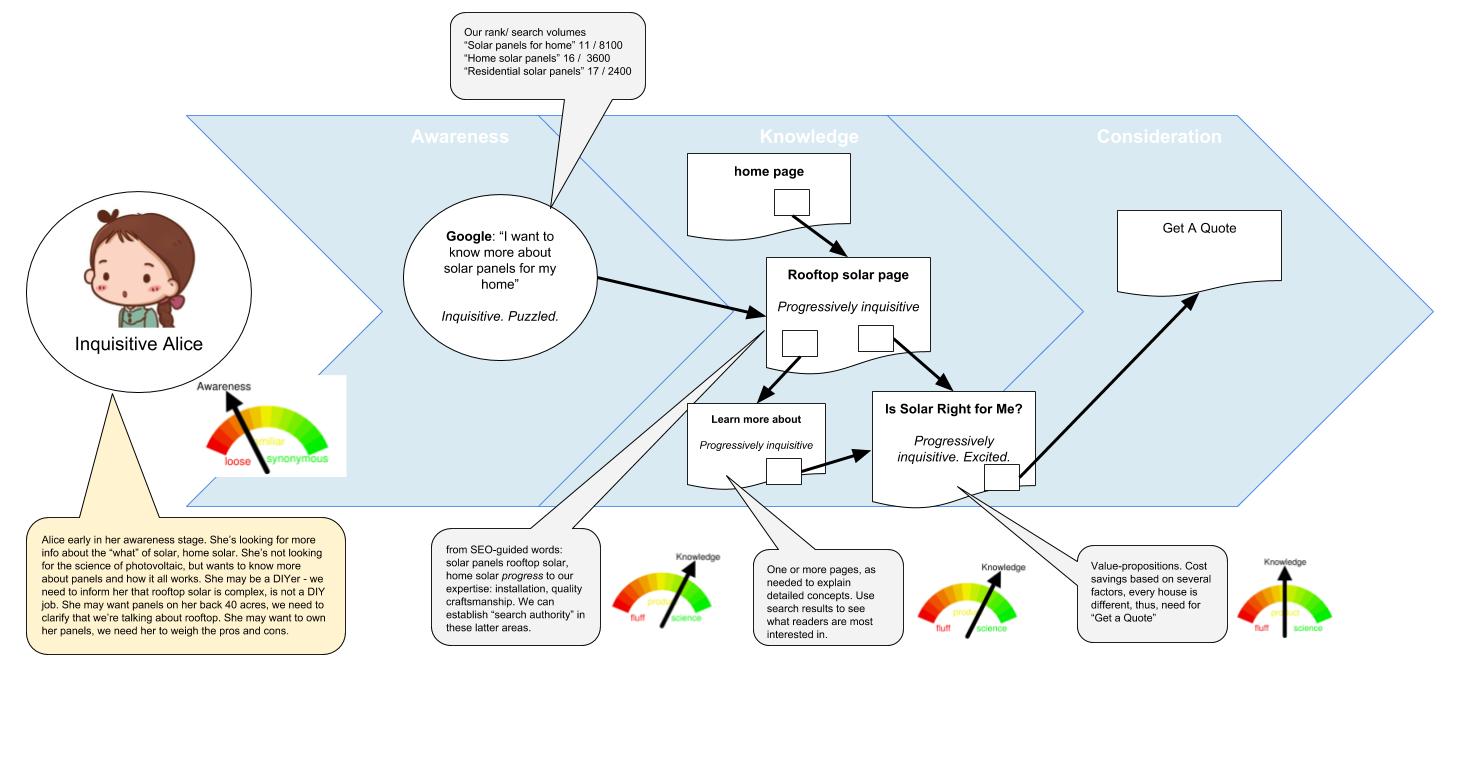
So, I developed my own template pattern, that contains these elements:
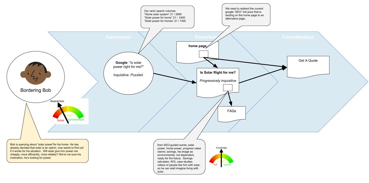
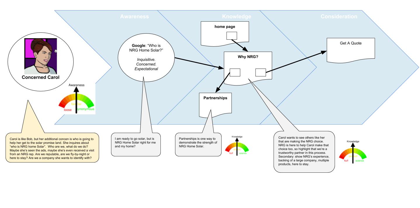
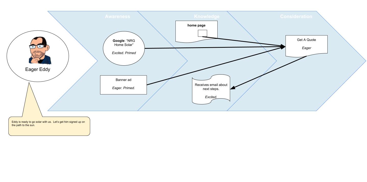
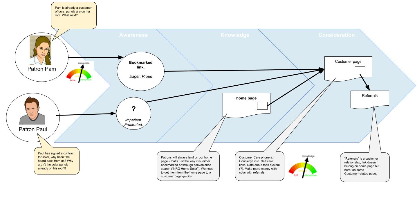
- A persona icon, typifying a particular type of customer or prospect. Give them a personable name, and a picture. It’s cute, yes, but it’s also a helpful shorthand in later conversations about your website, call center, whichever touch points you’re discussing – “What about Bob?”.
- A chevron indicating progress through the customer stages of Awareness, Knowledge, and Consideration (I’ve seen other ways to categorize such stages, but these three steps are nice and clear).
- Touchpoints, here represented as ovals or document icons. I had not done enough of these to come up with a definitive iconography yet, but the intent here is to recognize “outside” touch points (such as a google search) and web pages. Customer journeying extends beyond websites, so icons to represent a phone call, an email, a direct mail piece, etc., might be helpful. Give a short name to each touch point, and, in italics, an emotional state.
- Lines and arrows to show the expected path the persona will take through touch points. As marketers, we’re of course expecting them to progress through the awareness, knowledge, and consideration stages, though some personas, such as Eager Eddy, may “leap” directly into a later stage.
- Callouts to add short explanatory details. Keep the call outs in lanes above or below the chevron. Each persona definitely requires a call out, explaining the persona, their context, questions on their mind. I definitely encourage using typified questions as an easy way to condense the posture and emotional state of the persona. Short representative questions are useful here, as they are commonsensical and we can all relate to them. Use other call outs to add a bit of depth to each touch point, based on feedback you’re getting while laying out the journey map and discussing with others.
- Meters. This was one I was still working out, so it’s not fully fleshed yet. It is intended to represent the depth of content we expect to give the persona at each stage. If it’s useful, the meter is a guide to later content writers on how much detail is expected on a touch point (web page content, for example). I’m amused, though, at the way I ranged these – Awareness goes from loose, to familiar, to synonymous. That is, the consumer is so aware of us they think we’re the same as the subject – think Xerox or Apple, for example. Knowledge I categorized from fluff to authoritative – my intent there was to indicate whether we need to give a scientific treatise on the subject, just emotional fluff, or somewhere in between.
With these as elements, here are some of the persona maps I developed for web visitors to our Home Solar website. I envisioned using these to describe our full customer journey as well through multiple channels – phone calls, a sales visit, the contract, signing etc. There are different emotional states and knowledge levels at each of these states, and these maps can help engender internal discussions in your organization on how best to treat each touch point – what approach resonates with their emotional stage, what level of collateral material best meets their knowledge needs, what happens next after you’ve concluded a touch point (and how to guide the consumer to traverse to that next step), etc. Also, another useful discussion: what if your touch point is used by more than one persona? That may highlight conflicts with the emotional tone and level of knowledge